da-kuk/E+ via Getty Images
This article was first released to Systematic Income subscribers and free trials on Mar. 13
Welcome to another installment of our CEF Market Weekly Review where we discuss CEF market activity from both the bottom-up – highlighting individual fund news and events – as well as top-down – providing an overview of the broader market. We also try to provide some historical context as well as the relevant themes that look to be driving markets or that investors ought to be mindful of.
This update covers the period through the second week of March. Be sure to check out our other weekly updates covering the BDC as well as the preferreds / baby bond markets for perspectives across the broader income space.
Market Action
Somewhat unusually all CEF sectors were down this week in total price terms. Only one sector – EM Debt of all things – saw a bounce in NAVs while three sectors saw marginally tighter discounts. Year-to-date only the MLP sector is up with the next best-performing sector – Utilities – down about 6% in total price terms. Discounts are responsible for a bit less than half the loss in prices so far this year.
Systematic Income
Losses in March have already exceeded February levels. All three months this year have delivered the worst monthly returns since March of 2020.
Systematic Income
The total return CEF index is trading flat to its level about a year ago – highlighting that, in aggregate, the CEF space has delivered a zero return over the past year.
Systematic Income
Equity and Fixed-Income CEF betas have risen relative to the S&P 500 although they remain well off their COVID shock levels.
Systematic Income
Discounts have retraced their recent lows as each attempted rally has been knocked back by further weakness.
Systematic Income
Weekly CEF volumes are elevated but not signalling any capitulation by retail investors.
Systematic Income
Market Themes
This week we wanted to touch on an issue that comes up pretty regularly in CEF analysis – distribution coverage. For readers who aren’t familiar with the concept should take a look at our primer here.
There are basically two views out there in the commentariat regarding CEF distribution coverage. The first, which we share, is that distribution coverage is just net investment income or NII / distribution. This ratio can be defined over one month or longer periods.
The second view is that distribution coverage should be defined as total NAV return / distribution. The basic difference between the two approaches is that, while both definitions include income, only the second includes capital gains (realized or unrealized). Proponents of this second capital gains approach take the view that income is just a portion of total return and it is total return that drives the value of the fund’s portfolio where distributions ultimately come from.
To make this somewhat more concrete, consider a fund that generated $1m of NII over a given period and $3m of net realized and unrealized gains. If the fund distributed $2m over the same period, the first approach says that distribution coverage was 50% while the second approach says that distribution coverage was 200%.
Our basic view is that it doesn’t matter what definition of coverage anybody uses – we can fight till kingdom come about whether a fund’s coverage is X or Y based on income or net realized/unrealized gains. What matters is how useful a given definition is and whether it helps investors understand the internal dynamics of a given fund.
Distribution coverage from income (i.e. the first definition of NII / distribution) is, in our view, a much more sensible definition to use because it’s simply more useful than coverage based on capital gains. And it’s more useful because we can expect it to remain broadly similar over an extended period of time through different market environments. So, a fund with 90% coverage according to this definition is pretty likely to stay in an 80-100% range over the coming months and quarters – there shouldn’t be any massive surprises even if markets move around.
The second reason this version of coverage is useful is because it can provide a good sense of how coverage is going to evolve going forward based on the fund’s asset profile (fixed or floating), leverage profile and cost, fees, etc. For instance, short-term rates have already moved higher and are very likely to increase further over the coming months so funds with fixed-rate assets and floating-rate liabilities will see an erosion in income and (income-based) coverage (at current distribution levels) while funds with primarily floating-rate assets should see an eventual increase in income and (income-based) coverage.
Third, this definition of coverage is much more tightly linked to how funds actually behave with respect to their distributions. For instance, funds will often marginally adjust their distributions in response to shifts in their immediate income generation capacity. For example, a fund that deleverages (i.e. reduces its base of income-producing assets) often cuts its distribution as a result while a fund that, say, sees its leverage costs fall often raises its distribution. If managers found the second definition (i.e. the one based on capital gains) more appropriate they would mostly look through such temporary changes and keep their eye on the secular return their fund could generate over the longer-term.
Fourth, CEF houses that make the point of calculating their coverage ratios on a monthly basis such as PIMCO, Nuveen, BlackRock and Eaton Vance all use the first definition i.e. the one based strictly on net investment income.
To return to our key point that what matters is how useful a given definition is, let’s see what distribution coverage looks like in the capital gains definition. If we use something like the BlackRock Science and Tech Trust (BST) as an example, the fund’s coverage for the preceding quarters was: -924%, 270%, 277%, 193%, 1592%, 375%, 1747%, -36%, 736%, -181% and so on. It’s not at all obvious how this sequence of numbers is at all helpful. If anything it’s more likely to give investors heart palpitations rather than provide any useful insight of distribution coverage.
Clearly this set of numbers, which looks like it was spit out by a random number generator, is also useless in helping investors forecast coverage over the coming quarters. The only way you can have a sense of what capital-gain coverage of BST is going to be over the next few quarters is if you know where its holdings will go. And frankly, if you know that, you need to be running a massive hedge fund rather than puzzling over coverage of CEFs.
Commentators who pitch equity CEFs (ex-covered call funds) often get very defensive whenever it is pointed out that these funds typically have very low (and often negative) net investment income and, hence, income coverage that is not far from zero. They say, no no look, this fund has generated 8% returns per annum over the last X years while paying 8% in distributions so coverage is actually 100%. This attempt to pigeonhole equity funds into the income distribution coverage definition results in something that is just not very useful. The sharp rally in equity markets in 2021 showed very high capital gain coverage levels for equity funds and the recent drop in equity markets resulted in very negative levels of capital gain coverage levels. Ultimately, investors who hold equity CEFs shouldn’t do so on the basis of very volatile and uncertain capital gain coverage definition but because they just want to hold stocks in a CEF wrapper. There is certainly nothing wrong in doing this, however it should not be done by relying on a not-very-useful definition of coverage.
Market Commentary
Last week brought some CEF distribution changes. There were a few notable cuts in Muni CEFs: (EVM), (EIM), (VPV), (BLE), (MYD), (BNY). The cuts in muni funds are arguably more visible because it’s by far the largest CEF sector. As we have highlighted last year the sector was about to face income pressure due to rising short-term rates, resulting in a significant number of distribution cuts over 2022.
That said, the sector has some benefits relative to other fixed-income sectors. First, munis tend to trade to the first call date rather than their maturity because they are issued at a high premium which shortens their duration considerably. Second, muni CEF leverage costs will not increase as quickly as those of other CEFs because SIFMA – the base rate for muni CEF leverage – moves up at roughly 2/3 the speed of Libor given its tax-exempt nature. This will allow muni CEFs to see smaller drops in income than other fixed-income leveraged CEFs. Third, tax-exempt CEFs are more attractively valued relative to the broader CEF space.
Finally, muni CEFs are going to be more resilient in a typical flight-to-quality sell-off which we haven’t seen yet in credit despite some wobbles in equity markets. Credit spreads have continued to creep higher with High Yield corporate credit spreads now around 4% which is still fairly expensive relative to their historic range – see the chart below. Recall spreads hit double-digits both in March 2020 and during the GFC.
Systematic Income
February NAVs have come in from CLO Equity funds. The Oxford Lane Capital Corp (OXLC) fund reported a 6% drop in the NAV – in effect wiping off 8 months of gains. The relative illiquidity and implicit 10x leverage of CLO Equity securities means CLO Equity NAVs are going to be volatile in a market period like the one we are going through now. The saving grace of CLO Equity is that so long as defaults stay low, higher discount margins allow managers to reinvest loan repayments into higher-yielding loans. This will offset some of the initial pain due to the increase in Libor which pushes CLO Equity income lower (due to asset-side Libor floors on loans and lack of Libor floors on CLO debt).
The Eagle Point Credit Co (ECC) saw a 7.5% NAV drop while the Eagle Point Income Co (EIC) saw a 4% NAV drop for February. These are also roughly their year-to-date NAV drops as well – total NAV returns are marginally higher as these don’t include distributions. Overall, these are clearly significantly worse than loan CEFs which have a roughly -2% total NAV return year-to-date however it’s pretty good relative to other sectors most of which are off by about the same amount – the High Yield bond CEF sector has a -6.5% total NAV return YTD, Multi-sector is down about 6%, Preferred CEFs are down 7.5%. EIC is probably trading right now at a 2-3% premium given the moves in credit spreads since month-end. This isn’t cheap so waiting for a better entry point makes sense. The NAV itself has become relatively attractive however the discount isn’t great and it would be good to have both the NAV and discount at decent levels before adding to the position.
EIC has also continued to increase its allocation to CLO Equity securities at the expense of CLO Debt. CLO Equity allocation has risen from 24% to 31% in just 6 months to Dec and can rise up to 35% given the fund’s mandate. CLO Equity has much higher yields – the deals the fund added in 2021 have an average effective yield of 16.3% versus 8% for its new CLO Debt deals (total portfolio yield being 10.8%).
This shift in allocation towards CLO Equity makes sense in the context of the fund’s recent turn to a preferred stock (EICA) to source most of its leverage. Preferreds are a very resilient, if more expensive, form of leverage, making them more suitable to less liquid CLO Equity holdings. Since preferreds are not marked-to-market (unlike repo or credit facility) they can’t immediately force a company into a negative feedback loop of lower prices driving margin calls, driving forced sales and further lower prices. All CLO Equity funds use preferreds and bonds for their source of leverage. OXLC has been blow out of repo and credit facility a few times so clear lessons have been learned by sector managers.
Getting a handle on income of CLO Equity funds is always tricky. The best way to do that is to take the effective yield figures (themselves estimates) provided by EIC, take out the cost of the preferred, credit facility and fees. That leaves us with yield on net assets of around 12.2%. With a NAV distribution rate of 8.9% there is more room to increase the distribution.
There was a recent headline that PIMCO could “lose billions” in case Russia defaults on its debt. With the country’s rating just a smidgen above a default rating, its FX reserves frozen and with bonds trading at 30% a default by Russia on its hard-currency debt is a real possibility. PIMCO’s total position across CDS and bonds looks to be around $2.5bn. Most of the $1bn sold CDS position sits in the $140bn Income Fund so not really a crippling loss even in the worst case scenario. However, it’s also important to highlight that PIMCO could also make money on the CDS even if Russia defaults because of the weird ways in which CDS works. For instance, last week bonds were trading at $30 while CDS was around a $60 price when put into equivalent terms (distressed CDS trades in “upfront + spread” terms and would be quoted in terms of the loss likely to be incurred akin to how insurance is quoted). The reason CDS looks stronger than bonds (i.e. pricing in a smaller loss) is that people don’t think CDS will pay out the exact losses on the bonds. There are some complications here having to do with Russia being able to pay in RUB on some bonds, a potential technical squeeze driving up bond prices as people scramble to buy those bonds that would be deliverable into the CDS auction, people not being able to deliver the right bonds at all etc. In retrospect, a truly inspired trade would have been to sell Russia CDS and to short Russian hard-currency bonds to monetize this technical dynamic – it’s not clear if any of the fund managers did this and it doesn’t appear that PIMCO did. Overall, PIMCO will probably take a small loss and move on.
Cohen preferred CEF Select Preferred and Income Fund (PSF) is trading right on top of the Tax-Advantaged Preferred Securities and Income Fund (PTA), its sister fund, in discount terms, with PSF at a 7.4% discount and PTA at a 9.5% discount. In our view, this makes PTA no longer the most attractive fund in the Cohen family. This is because PTA charges 1% while PSF charges 0.7%. That doesn’t seem like a lot but it makes a difference particularly given the higher-quality focus of the funds. Both trade at current yields of around 7.37%.
Systematic Income CEF Tool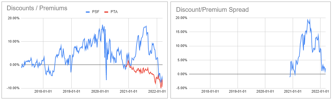
The Western Asset Mortgage Opportunity Fund (DMO) released its shareholder report. Last 6-month NII was $0.0733 – equivalent to distribution coverage of about 70%. Recent actions have improved coverage from both ends – there was a cut not too long ago and there were increased borrowings plus the NII has a positive beta to Libor which has already started to increase in expectation of imminent Fed hikes. The fund’s mortgage focus also means it is less likely to be directly impacted by geopolitical noise. Its NAV is down less than 4% year-to-date – much better than the average fixed-income fund.
Stance And Takeaways
Apart from a rotation into a few perpetual municipal CEFs from their term counterparts and a marginal increase in a few very attractively-valued credit funds, we have remained patient as the recent drawdown has developed.
In our view, the combination of fairly unattractive underlying asset valuations (i.e. relatively tight credit spreads), an increase in leverage costs that is already playing out and an uncertain macro picture with analysts just beginning to mark up the likelihood of a recession suggests a less than compelling picture of going all-in in CEFs.
We continue to find the tax-exempt sector attractive for the reasons discussed above while opportunistically evaluating opportunities in the broader space. At current valuations we like a handful of funds such as the multi-sector Western Asset Diversified Income Fund (WDI) trading at a 13.1% discount and 8.8% current yield, the high-yield bond fund BNY Mellon High Yield Strategies Fund (DHF) trading at a 11% discount and 8.3% current yield, and the Blackstone Long-Short Credit Income Fund (BGX) trading at a 9.3% discount and 6.58% current yield.