By exploring the notion of charts as metadata, we find that the variety of bespoke data graphics offers a useful, interoperable platform for exploratory visualization of a knowledge graph.
Sandbox for exploratory visualization, infographics, and meta-analyses
To address the trade-off between usability and expressivity, we opt for maximal expressivity in terms of content creation, taking usability into account by making all examples open-source and readily available for re-use. For example, domain experts without fluency in query or visualization languages (e.g., SPARQL, Vega-Lite) can interact with data in the knowledge graph by browsing a gallery of interactive charts, and those interested in creating their own charts have the code behind each chart as a precursor to adapt or modify for their own purposes. In this way, the collection of example queries and chart specifications provides a form of reusable documentation for accessing and viewing data in the knowledge graph.
To demonstrate the concept of charts as metadata, we extended the visualization capabilities of MaterialsMine (materialsmine.org) to accommodate the saving and processing of these bespoke data graphics. The knowledge graph at MaterialsMine, previously NanoMine8,31, contains curated data from research articles on polymer-matrix nanocomposite materials in the scholarly literature along with metadata describing the materials, processing, characterization, and bibliographic information from those articles. Structured as linked data conforming to semantic web ontologies and vocabularies32, data and metadata are made accessible through a SPARQL endpoint on the web.
Tailored interactive charts containing data from the knowledge graph range in purpose and complexity. Depending on the SPARQL query, datasets vary from individual sample data linked to a research article to meta-analyses of all articles curated into the knowledge graph (Fig. 1). All examples shown here use some combination of layered and concatenated views combined with selections in Vega-Lite to provide explorable, interactive views of data. Following the mantra of overview first, zoom and filter, then details-on-demand33, these data graphics use elements of interactivity to display aspects of a dataset that exceed the capability of a static representation. Common modes of interaction include tooltips, conditional display on hover interactions or selections, cross-filtered views, and pan and zoom.
Offering the full expressivity of SPARQL and Vega-Lite for specifying charts resulted in a number of interesting and often unanticipated interactive views of data in the knowledge graph. For example, rule marks with conditional opacity enable the overlaying of derived mechanical properties (tensile modulus, tensile strength, elongation at break) over representative curves showing raw tensile test data (Fig. 2a). Using Vega-Lite transforms and layered rule marks permits the custom scaling and plotting of linearized Weibull distributions for real-time calculation of dielectric breakdown strength (Fig. 2b). A query of articles and the material systems studied within them offers an interactive view of trends in polymer nanocomposite materials research (Fig. 2c). Another meta-analysis demonstrates the results of entity resolution with the ChemProps API (Fig. 2d)34. Concatenated sub-views and text formatting parameters result in a stylized infographic demonstrating some of the ways to enhance data exploration by adding interactive elements (Fig. 2e). In addition to concatenated sub-views, sequence generators and Vega-Lite transforms make possible an embedded explanation of dynamic mechanical analysis for viscoelastic material properties atop experimental data (Fig. 2f). These and over 150 other examples currently populate the gallery of charts in the MaterialsMine knowledge graph.

Interactive views of sample data, meta-analyses, and stylized infographics. Charts shown here are specified by a SPARQL query (semantic context) as well as Vega-Lite specification (visual context). The snapshots of interactive data graphics shown here display (a) mechanical tensile testing data curated from Bandyopadhyay et al. (2005)48, transformed into a layered composite view; (b) a Weibull plot of dielectric testing data using custom y-axis scaling and the regression transform to estimate dielectric breakdown strength (DBS); (c) a meta-analysis of nanocomposite filler materials in curated research articles per year of publication, highlighted to show the trend for graphene; (d) a meta-analysis of entity-resolved compound names (computed by the ChemProps API34) versus curator-provided strings; (e) an infographic showing a dataset with increasingly interactive views; and (f) an explanatory graphic for viscoelastic data. These examples created for the materials science domain represent a small subset of the variety of datasets and visualizations made possible by using SPARQL queries and Vega-Lite specifications to capture interactive views of content from a knowledge graph database.
The examples presented here by no means represent the only way to query and display these data. By making available the expressivity offered by SPARQL and Vega-Lite, we encourage experimentation and rich customization in the pursuit of effective means of data exploration for a variety of applications. Any individual data visualization will have finite applicability. However, the collection of such open-source visualizations enabled by this approach can accomplish a variety of tasks and illuminate remote corners of a knowledge graph.
Leveraging dereferenceable URIs in a knowledge graph
To avoid naming collisions, knowledge graphs employ URIs to globally identify resources without ambiguity. Using well-established internet protocols (e.g., HTTP) helps to ensure global uniqueness among distributed systems on the semantic web. A helpful practice for documenting resources involves the owner of a domain having a representation delivered by a server (e.g., HTML page) when a URI is requested through internet protocols. URIs can exist solely as identifiers, but those with available representations on the web are known as dereferenceable URIs.
URIs can be returned in the results of a SPARQL query, but a column of URIs in a table may be less useful than an interactive visualization that allows a user to sort and refine the results of interest. Overview first, zoom and filter, then details-on-demand33. We identify two encoding channels in Vega-Lite that make the language well-suited to knowledge graphs: the url encoding channel for image marks (Fig. 3a), and the href (hyperlink reference) encoding channel for other data marks such as text (Fig. 3b) or point marks (Fig. 3c). First, images serve as useful visual representations in many scientific domains, and rendering them on-demand via dereferenceable URIs avoids the need to download or cache a full set of images. Second, the practice of hyperlinking to primary sources or representations leverages the notion of linked data by directing to additional information about resources outside the confines of a given chart.
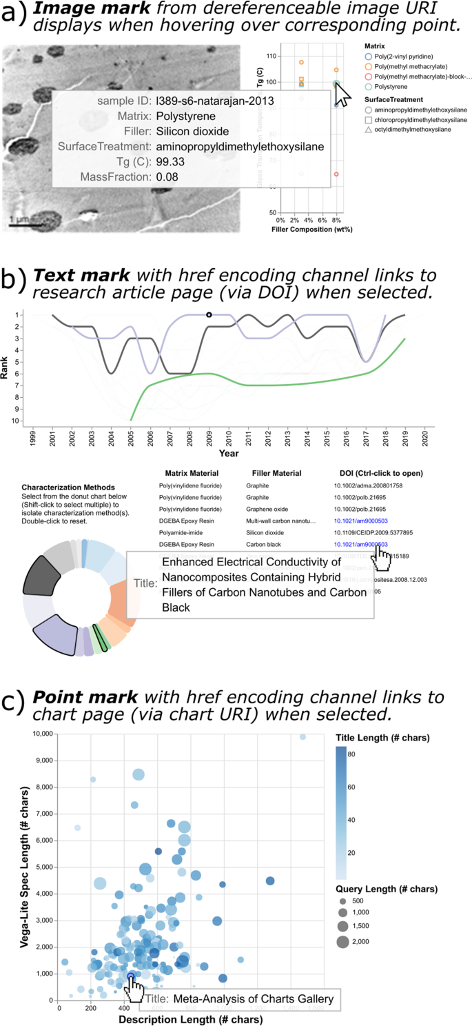
Direct linking to representations of resources in the knowledge graph. These charts make use of dereferenceable URIs in the knowledge graph to display or link to resources. (a) Image marks with accompanying URL encoding channels are used to display curated sample images from Natarajan et al. (2013)49 corresponding to the selected points on the adjacent scatter plot. (b) Text marks with a hyperlink encoding channel link open the URL of a journal article DOI when selected. (c) A scatter plot displays charts published to the knowledge graph, arranged by the character length of their Vega-Lite specification and description. Point marks with the hyperlink encoding channel link to a chart page when selected. This final chart is self-referential; the highlighted point mark represents the chart itself.
Interactive data visualization offers myriad ways to explore a dataset, and we describe how knowledge graphs with dereferenceable URIs can expand the reach of these graphics to the entire Web through hyperlinks. By combining the strengths of knowledge graphs for storing knowledge and interactive visualizations for accessing knowledge, this approach provides a means for communicating data in a way that builds trust and makes data analysis more transparent, building on the idea that sharing the graphic should equate to sharing the data35.
Interoperability with other web platforms
The semantic web facilitates data exchange in a distributed manner by building on the infrastructure of the internet and encouraging the use of common vocabularies and ontologies. One demonstration of interoperability enabled by SPARQL is the extension for federated querying. Federated queries aggregate data from multiple sources by running sub-queries across distributed SPARQL endpoints on the internet. Furthermore, the ability to send a query to a public SPARQL endpoint via HTTP GET request and receive machine-readable results (e.g., JSON) enables other web platforms to query and process data from a knowledge graph.
Here, we demonstrate a two-fold example of interoperability by showing an example chart from MaterialsMine, with federated querying of DBpedia36, all within a reactive computational notebook on Observable (Fig. 4). Platforms such as Observable (https://observablehq.com), which natively supports Vega-Lite, can fetch a chart’s metadata, parse the query and chart specification, run the query for the chart’s data (in this case, at the same endpoint), then render those data as an interactive Vega-Lite chart. In this example, the query contains a SERVICE clause to the DBpedia SPARQL endpoint to return the English-text abstract for the material compound “Silicon dioxide” from Wikipedia, and the Vega-Lite specification displays this abstract as a text mark on the chart (Fig. 4, red dotted lines). At present, federated querying adds several seconds to the query runtime, therefore the development of such queries requires optimization.
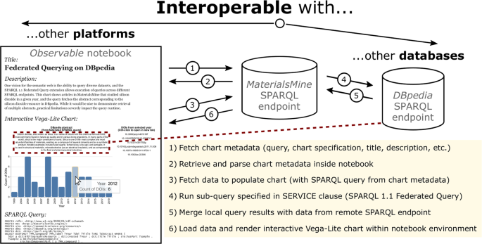
Interoperability with other web platforms and FAIR data sources. The ability of public SPARQL endpoints to send queries and receive data through internet protocols enables interoperability within a query (e.g., federated querying from DBpedia36) as well as displaying and processing information from the knowledge graph using external web-based platforms, such as an Observable notebook (https://observablehq.com/@mdeagen/figure-4-notebook).
Interoperability is arguably the most challenging of the FAIR principles to implement, and we have shown how a SPARQL-equipped knowledge graph can interoperate with other public SPARQL endpoints as well as display charts and their metadata on an external platform that supports Vega-Lite. In the Discussion section, we present design considerations for queries and chart specifications that arise in this approach to FAIR scientific data visualization.
Decoupling (meta)data from graphical representation
Data graphics assemble and contextualize information for scientists, similar to how metadata package and describe data for machines. By choosing to model a data graphic (e.g., interactive Vega-Lite chart) as a form of metadata itself, researchers can simultaneously capture human-interpretable and machine-interpretable representations of their research output. This FAIR approach to data visualization leverages Vega-Lite’s grammar of interactive graphics, which differs fundamentally from conventional tools (Excel, Plotly, Matlab, etc.). By describing an interactive representation of data as a JSON object, a Vega-Lite specification illuminates the inherent structure of most data graphics, as opposed to a chart typology that requires many preset chart types to achieve expressivity. Upon introducing the ability to encode URIs as hyperlinks in data marks, Vega-Lite becomes an ideal tool for combining with semantic web technologies. While a formal grammar of graphics ontology falls outside the scope of the present work, such an effort could build upon these demonstrations of the reciprocal benefits of SPARQL and Vega-Lite and include stakeholders from both the semantic web and data visualization communities.
To further illustrate the benefits of the combined approach of SPARQL and Vega-Lite, we can consider the substitution of either tool with traditional alternatives. In the case of SPARQL with a typology-based plotting tool, one loses expressivity in terms of building interactive data graphics and may obscure the visual meaning captured in the rendered graphic. The inverse case—an isolated tabular dataset with a Vega-Lite specification—may lack sufficient metadata and semantic context necessary to interpret the raw data. With the combined approach, data and visual representations exist as metadata, with the added benefit that interactive charts can use hyperlink encoding channels to provide direct access to dereferenceable resources in the knowledge graph. Jointly, these tools embody FAIR scientific data visualization, and we elaborate further on the framing of specific FAIR guiding principles around these notions in the Methods section.